
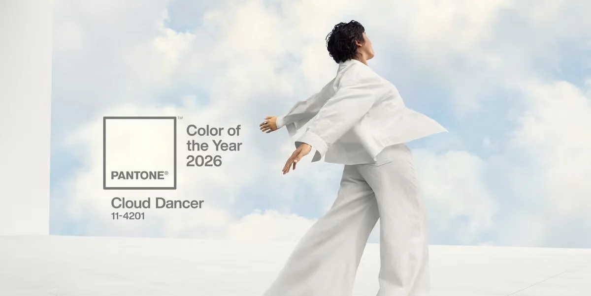
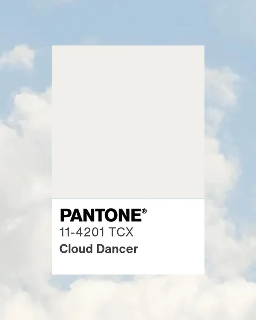
Pantone Colour of the Year 2026: What “Cloud Dancer” Signals for Brands
Every year, one colour captures global attention across fashion, interiors, packaging, digital design and branding. For 2026, Pantone has chosen something unexpectedly restrained: Pantone 11-4201 Cloud Dancer.
At first glance, it is a soft, luminous white. Underneath, it is a cultural signal.
For brands, that distinction matters.
First, What Is Pantone and Why Should You Care?
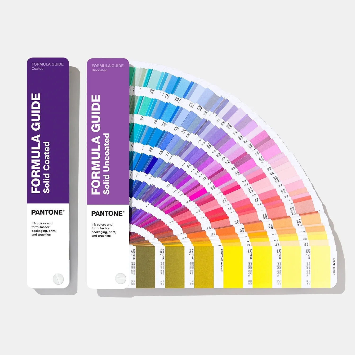
Pantone began in the 1950s as a colour matching system for printers. It created a universal language that allows designers, manufacturers and brands to reproduce precise colours consistently across materials and geographies.
In 2000, Pantone introduced the Colour of the Year. This was not simply a trend forecast. It was positioned as a cultural reflection. Each year, Pantone’s team analyses shifts in fashion, art, technology, social behaviour and global sentiment to select a colour that represents the wider mood.
The Colour of the Year influences product launches, packaging design, interior collections, beauty releases and brand campaigns worldwide. It becomes a shared reference point across industries.
For brands, it is less about copying a colour and more about understanding what it represents.
Why Cloud Dancer?
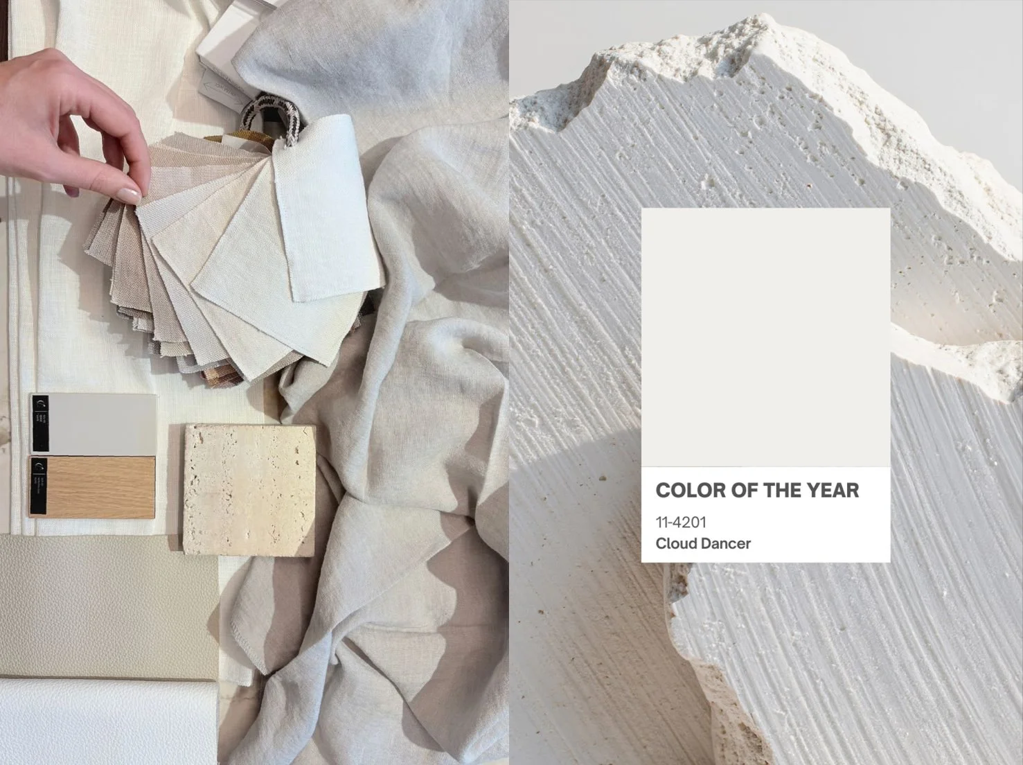
Cloud Dancer is described by Pantone as a luminous and elegant white that conveys clarity, purity and space for fresh ideas to take shape.
Choosing white is significant.
In recent years, Colour of the Year selections leaned bold and expressive. Saturated reds, energetic violets, confident pinks. Those colours matched a cultural appetite for visibility and statement.
Cloud Dancer moves in a different direction. It reflects a desire for calm, focus and refinement. It suggests a cultural shift away from visual noise toward clarity and intentionality.
For brands, that shift is not aesthetic alone. It is strategic.
What This Tells Us About the Market
When a global authority selects a soft white as its defining shade, it reveals something deeper about consumer psychology.
Clarity is aspirational.
Restraint is premium.
Space is powerful.
In branding and marketing, we are seeing fatigue around overdesign and overcommunication. Audiences are more selective. They respond to brands that feel confident enough not to shout.
Cloud Dancer symbolises a move toward thoughtful minimalism. Not sterile minimalism, but luminous simplicity. A tone that feels elevated rather than empty.
For luxury, it reinforces quiet confidence. For tech, it supports usability and mental ease. For lifestyle brands, it suggests calm authority and considered living.
What It Means for Brand Strategy
The biggest mistake companies make with Colour of the Year announcements is treating them as decoration. Adding a new shade to social graphics without reconsidering the wider system.
The real opportunity lies in understanding the cultural context behind the colour.
Cloud Dancer encourages brands to ask:
Is our visual identity clear or cluttered? Does our packaging feel intentional or excessive? Does our website create space for users to think and act? Are we communicating with focus or adding to the noise?
White in branding is not absence. It is positioning.
Used strategically, a luminous neutral can elevate typography, strengthen hierarchy and increase perceived value. In retail environments, it can signal refinement. In digital experiences, it can reduce cognitive load. In packaging, it can convey purity, sustainability and trust.
Cloud Dancer is not about removing personality. It is about framing it more intelligently.
How We Think About It at UNYQ
As a branding agency, we do not chase colours. We analyse what they reveal.
Cloud Dancer tells us that the next wave of strong brands will not compete on loudness. They will compete on clarity. They will design systems that breathe. They will create visual environments that feel confident, not crowded.
If your brand is entering a repositioning phase, launching a new product, or refining its identity, this cultural shift is worth considering.
The question is not whether you should use Pantone 11-4201.
The question is whether your brand is designed for the world Cloud Dancer represents.
And if not, it may be time to rethink the space you occupy.